“there is always a better way
to do it”
“pass go”
Part of the reason that I sit here, struggling to share my experiences “testing” the design for this website is because the story has already been told- on every page, each audio recording, and post.
Building the site and completing my dissertation was a long, arduous road of trial and error. It was especially problematic, because I’m an ideas person. I know deep down there is always a better way to do it- something unique, more interesting, and definitely not what I am able to make happen. I just know how it should look.
With the site, every step I took forward, I was blown back three. My technical deficiencies stopped me from being able to bring my vision to life. Before I became too frustrated to give it another go, there was a little voice in my mind: “practice what you preach.”
I wasn’t going to nail the design of a page on the 1st try. Unfortunately, it took me at least 5 tries with each page. Ultimately, each page wound up showing the “idea,” but it would take a real designer to finesse it. It was the nature of writing/designing and unfortunately, the reality of working alone- no collaborative effort. This meant that there was always a need to gather feedback. The project had plenty of room for improvement.
I couldn’t possibly recount every instance of feedback. Whether I had asked my husband to look over a part of the site, played a lesson excerpt during a conference presentation, or my committee chair read through transcripts for edits, these moments compounded into a general sense of where I needed to go with the project.
picture retakes
To provide an insider’s look at my methods for testing the website, I will focus on my specific work with Noelle’s Case Study page (see image to the left).
finding the right light
I wanted to center student work from the DFA to FYC course on the website. Not only would it illustrate how students achieved learning outcomes, but it would also color the site with variety.
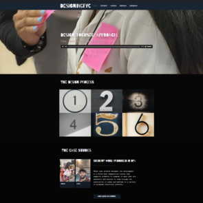
I decided on a few features to highlight on the landing page: my artist’s statement, the design process, and the student case studies (see image to the right).
I used a close-up screen capture of Noelle’s performance art as the main visual on the landing page- I like to think of it as brand recognition for the DFA.
Then, I moved back to the design of the case studies to illustrate:
- How students, in a Design-Focused Approach to First Year Composition, demonstrate achievement of multimodal learning outcomes
- How students, in a Design-Focused Approach to First Year Composition, qualify the effects of design-thinking on their writing process and artifacts
I had to think about the following elements as I designed an effective layout:
- Student’s use of the Design Process
- Student’s work samples in the Design Journals and Project Builders
- Research interviews with the student
- In-class conversations with the student and general classroom observations
- The course’s learning outcomes
- The overall objective of the DFA to FYC
- The genre conventions associated with a website
- Templates and page building tools
- My analysis of the student’s work as both an instructor and a researcher
1, 2
visual rhetoric
Was the layout a viable solution for designing the case studies? Would the design be accessible, yet impactful for site users (instructors)? Did the layout support the intended function of a case study?
1, 2
rhetorical awareness
Have I shown my interpretation of Noelle’s work and their ability to achieve learning outcomes? What will this show about multimodal pedagogy? What will it show about design-thinking in a writing classroom? What will it contribute to the field of writing studies?
audio capture 1
audio capture 2
how’d the test go?
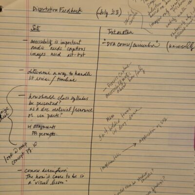
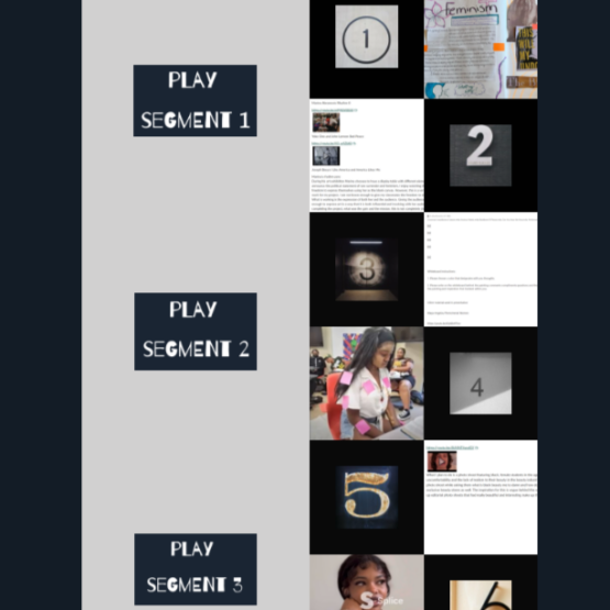
After I had worked through a few possible layouts with screen captures of Noelle’s work, I decided on a page that showed the 6 design steps. I placed 6 images of Noelle’s work that illustrated each of the design steps. Then, I shared the page with my dissertation chair. I wanted to be certain that the layout was navigable, but more importantly that it presented content that she expected. She agreed that the layout was well suited for exhibiting images of Noelle’s work to lay the foundation for the case study. However, she questioned how I would move beyond the design steps and into a deeper analysis of how Noelle’s work demonstrated learning outcomes. I had some work to do bridging the user’s expectations with the actual content.
The layout of the case study page showed 12 small squares (6 rows in 2 columns) on the right side. To the immediate left were 3 large squares (each taking up 2 rows). This layout allowed me to place the Design Steps in 6 of the squares and samples of Noelle’s work in the other 6 squares. Planning how to tackle the analysis was much more of a challenge, which is where I would do the academic work.
I had 3 squares to use for 1 case study. I did not have a reason to include any more images of Noelle’s projects, but I would have to present text-based content somehow. I sat with my notes for the curriculum and my charts for aligning the steps with a Design Journal or Project Builder. How would the design tools help the student to develop rhetorical awareness? It made sense to discuss the design process two steps at a time and create 3 segments for the case study.
-Design Steps 1 & 2 in Segment 1
-Design Steps 3 & 4 in Segment 2
-Design Steps 5 & 6 in Segment 3
Thus, I was able to determine an appropriate layout for the case study.
Despite having made an extensive list of elements to present the case studies on the website, I still had trouble visualizing how they might come together on a page. In a traditional dissertation, the case study is a chapter often written with figures, tables, and examples. I had already selected examples to illustrate the Design-Focused Approach (Design Journals, Project Builders, and interview transcriptions), but I could imagine linking a 20-page document to the case study page. It was an integral part of the dissertation project; it would undoubtedly help other instructors to understand a great deal about the curriculum and student experiences in the course. So, I had to MAKE IT WORK.
The most interesting aspect of this moment in the simultaneous development of the dissertation and the website is that design began to inform content and vice versa (Arola, 2009; Wysocki, 2001). While I attempted to find the right design layout, the options helped me to shape how I would present the content analysis.
Having 3 large squares available on the case study page prompted me to consider video recordings. This would allow me to show the whole Design Journal or Project Builder instead of just a thumbnail image. Because many projects were multimodal, it also allowed me to scroll through the student’s project while I talked through the analysis. This was a modal affordance of the website and likely would never have been considered through these means had it been a text-based paper format. Moreover, by performing the case study through this media, I made a decision with a rhetorical effect. Scholar Kristin Arola asserts, “…composing texts, more specifically making choices about the composition of a page or screen, helps individuals think through the ways in which design functions to make meaning and produce selves” in “The Design of Web 2.0: The Rise of the Template, The Fall of Design.” What was I saying to my audience by NOT presenting a chapter to read?
On the surface, this story may not appear to be about TESTING the site, but I assure that it is. I asked myself a lot of questions and made careful decisions. What could I do on the site that I could not do in a paper? What does this reveal about me as a writer? Designer? Instructor? Researcher? I had also asked for direct feedback from family, peers, and professors to gain an understanding of the user experience to inform revisions.
I was TESTING. Using the analogy that I have woven throughout the project, doing this work is a lot like that of a ceramist. When they create a mug, they may not always have someone else to test for functionality. They may test it themselves. Ask themselves questions. Pose hypotheticals and reflect.
The only thing that held the project back was me. My skill set constrained my vision. Maybe in the future I would have the chance to learn more and take the site pass go.
next blog-
DesigningFYC 2.0: Implications, Innovation & Sustainability