When something sits for a while, and you go to use it again- you inevitably worry if it’s as good as it was before. It makes me think about leftovers. You make a dinner and a week later your husband is standing in the fridge, Tupperware lid peeled back, asking, “is this still good?” My response 9 times out of 10 is “no,” but a savvier chef might say that there is a fantastic recipe for those leftovers. It just requires some work and a few more ingredients.
Initially, I hadn’t realized that my Canva presentation was an actual (and 3rd) iteration of the dissertation project. In my mind, I had reduced it to a snippet of the analysis work I would later expand. Although I was right in one way, I was terribly oblivious to an important aspect of designing a digital project. Working through Noelle’s projects, with a keen eye particularly on Project 4, I was able to frame the larger approach to the design of the website.
To return to my earlier analogy, I had forgotten that you can’t make something out of nothing. In fact, I already had valuable elements for my project. I kept playing with ideas about remixing/ redesigning- like when I said, “It was as though I would present features of the course and ask them what would you do?”
Shifting from a plan to employ the format of a dissertation to a loose collage exhibiting the work of my students did not solve the problem. I had to reconcile these extremes. My instinct was to refocus on the design process. The project argued for the Design-Focused Approach to FYC, which prepared students to be multiliterate, problem-solvers with a strong sense of rhetorical awareness. I centered the site on the design process, because both my students and I used it. I wanted to show what happened. I designed a landing page that used the steps of the design process as the central focus. All of the student work would be accessible from each of the design steps: define, research, ideate, plan, prototype, test and improve. I would save my methods and findings for a blog section.
Audio Capture 6
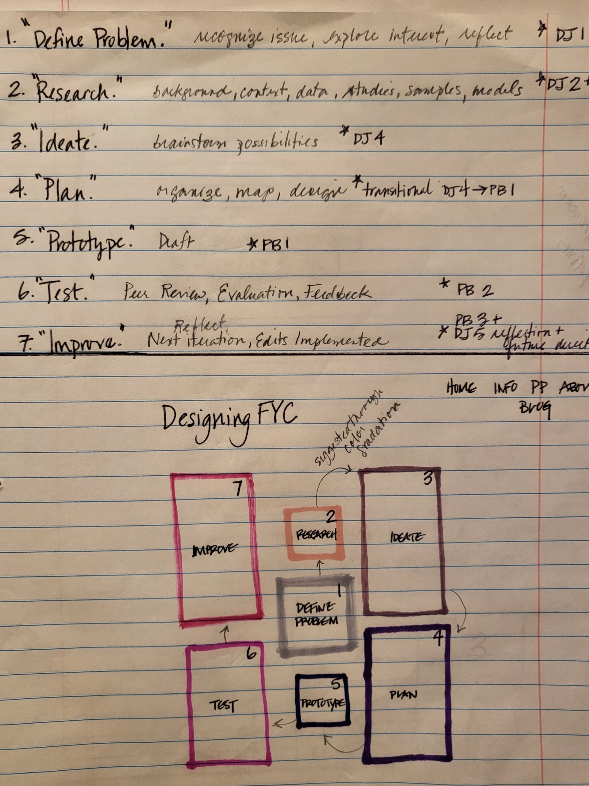
I was working with a set of 7 design steps at this point in time; however, I realized that it made more sense to include researching in the tasks performed in both the ideating and planning steps, like I had earlier. After redesigning the website’s landing page, which showcased the design process by its steps, I reduced to 6 steps. Below, in Figure 1, you will see the set of notes I drafted to identify the original 7 design steps and the correlating activities that students performed in their Design Journals and Project Builders. Then, I took the steps and sketched out a design for the landing page inspired by a food blog that I came across. A collage of rectangles and squares with images of a dish inside each shape was on the main page to the blog. The gallery-like quality appealed to me; it was vibrant and interesting. I could showcase the samples of student work inside each rectangle or square for my site. Moreover, I would select student work that illustrated each of the design process steps. Then, I could create a sequence for the shapes by inserting arrows or numbers to help direct the user.
FIGURE 1
audio capture 7
landing page 1.0
a smorgasbord
A sampling of student work is shown in the image to the left. Some of the images were used to illustrate each of the design process steps on the rectangular shapes featured on the landing page. Imagine each of these images being plugged into one of the shapes on the layout sketched in Figure 1.
Despite the geometric shapes, the landing page became very cluttered and difficult to understand once all the images were loaded. Accessibility was much too complicated.
landing page
2.0
versions of the same dish
To simplify the aesthetic, I thought about repeating the same image of the word “solution,” in each of the boxes- as the design process supports problem-solving. Thus, each step in the process brought the student closer to completing their project-to solving their problem. I would also apply color gradation from the first to last step to guide the eye through the sequence. Then, I played with the idea of beginning the 1st step with a blurry version of the word, “solution.” With the progression of each step, the word “solution” would sharpen and in the final step “solution” would be perfectly clear. I was intrigued by the symbolism and layers of meaning, but once I uploaded each of the image boxes into the layout, the result was horrific. I needed to remember that less was more. The page made no sense, especially for the purpose of the site. It would be confusing for a first-time user with no context.
“The image was visually striking, but in the context of the DFA to FYC, it took on even greater meaning.”
one key ingredient
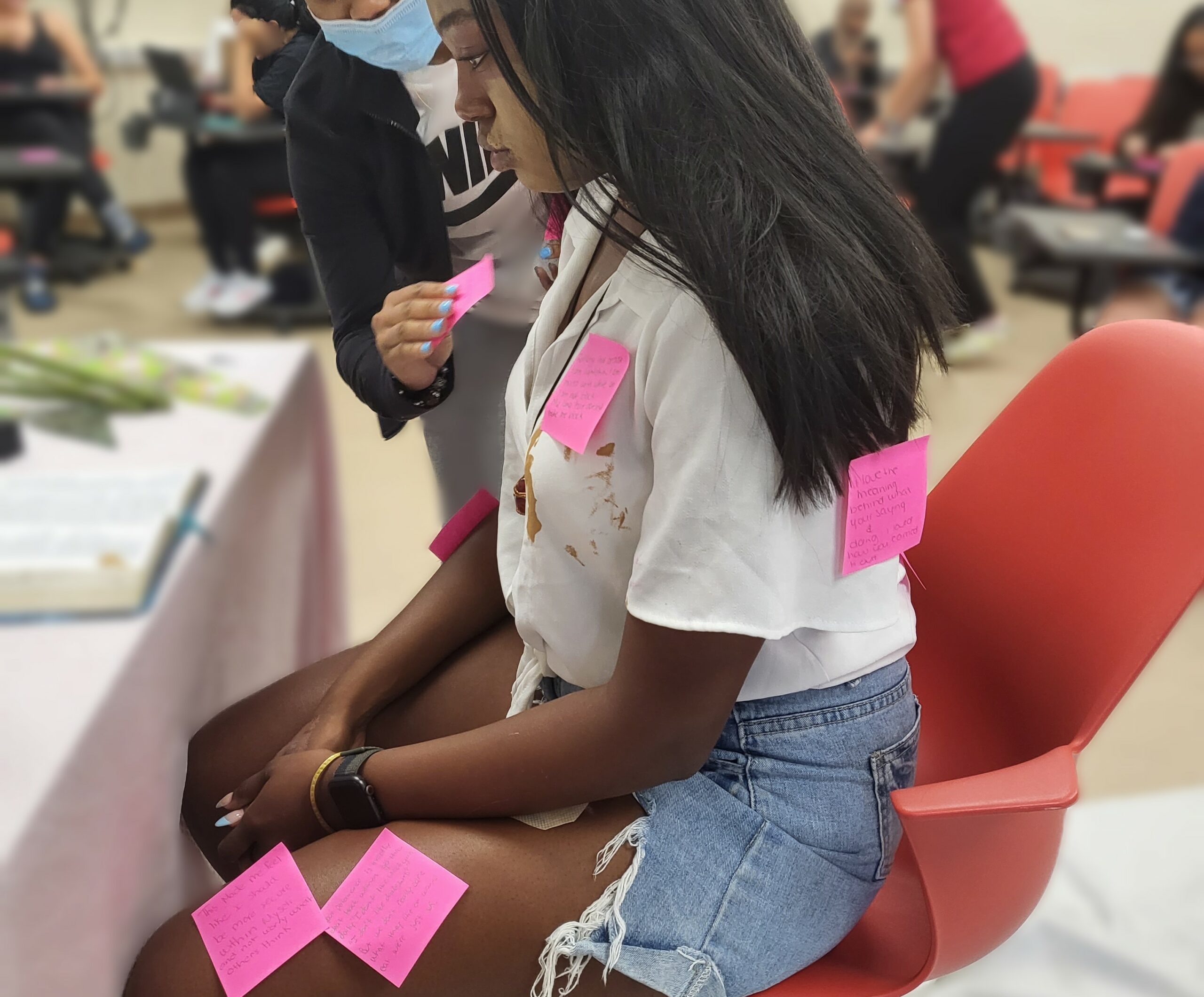
I had taken a screenshot of a moment during Noelle’s performance (their 1st project) and I used it on one of the slides in my 3rd project iteration. It showed Noelle with a long black wig and mismatched foundation swiped across their face. They were looking down toward their lap. A few hot pink Post-its had been placed on them. When I was selecting samples of student work to include on the landing page layout, I chose the same image again. The image was visually striking, but in the context of the DFA to FYC, it took on even greater meaning.
I took the image and dropped it into a completely new, blank landing page. Instead of employing some of the platform’s page builder supports, I decided that I would use my instincts to create the vibe of the site.
The result was perfect. The landing page was eye-catching and generated questions. Most importantly, it showcased meaningful work from a student in the DFA to FYC course. Then, it came to me. I would use a more straightforward approach to the design process. I located images of the numbers 1-6 and began to plot them in sequence immediately below Noelle’s image.
I had organized some pages and basic navigation features across the site once I had the landing page sorted. Much like the trial and error I experienced with the landing page, subsequent pages operated the same way. Although I had decided to keep the main menu simple, building each section and its pages required a lot of drafting and revising. In the current version, users can navigate to information about the dissertation project (Project), information about the DFA to FYC course (Course), a blog about how I built the site using a DFA (Methods), and a compilation of writing studies scholarship (References). This menu departed from my original ideas for navigating the site. At first, I tried to include too many features in the main menu- elements like my bio, an image gallery, and case studies. I wound up deciding that the current menu items were in fact THE most important. Each element (Project, Course, Methods, and References) contributes to a fuller picture of how writing and design processes align.
audio capture 8
next blog-